In this article, you’ll find a description of a Build a Dark Mode toggle Using HTML, CSS and JavaScript, an explanation of its importance, and a description of how Dark Mode toggles work using HTML, CSS, and JavaScript. It will all be done in a simple and beginner friendly way.
What Is a Dark Mode Toggle?
A Dark Mode toggle is an interface element that allows the user to change the themes of a website. The themes include a light theme and a dark theme. Typically, the light theme has a dark font over a bright background. The dark theme has a bright font over a dark background.
Over the last few years, Dark Mode has been growing in popularity. Almost all modern websites offer a Dark Mode feature. From social media apps to technical dashboards, offering Dark Mode has become the industry standard.
Why Dark Mode Is Important for Websites
Including Dark Mode on your website is no longer optional because it offers the following:
1. Improved User Experience
Reduced eye strain and improved readability in bad lighting help users engage with content for longer.
2. Updated Site Aesthetic
Having Dark Mode available can create a more professional and modern appearance for your website.
3. Power Efficiency
Dark Mode can help preserve battery life on devices with OLED/AMOLED displays.
4. Meeting User Expectations
Customer demand for Dark Mode is growing, and many users will avoid using a site that does not provide it.
What You’ll Learn:
- How to structure the Dark Mode with HTML
- How to style the Dark Mode using CSS
- How to make the Dark Mode functional with JavaScript
Step 1: Structure the Dark Mode with HTML
Start by creating a new file called (index.html). Then, copy and paste the HTML code provided into this file. Remember to save it with the (.html) extension.
<!DOCTYPE html>
<html lang="en">
<head>
<meta charset="UTF-8">
<meta name="viewport" content="width=device-width, initial-scale=1.0">
<title>Dark Mode Toggle</title>
<link rel="stylesheet" href="style.css">
</head>
<body>
<div class="container">
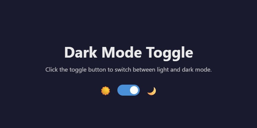
<h1>Dark Mode Toggle</h1>
<p>Click the toggle button to switch between light and dark mode.</p>
<!-- Toggle Switch -->
<div class="toggle-container">
<span class="toggle-label">☀️</span>
<label class="toggle-switch">
<input type="checkbox" id="darkModeToggle">
<span class="slider"></span>
</label>
<span class="toggle-label">🌙</span>
</div>
</div>
<script src="script.js"></script>
</body>
</html>
Step 2: Styling Dark Mode with CSS
Create a new file called (style.css) and copy the provided code into this file. Don’t forget to save it with the (.css) extension.
/* CSS Variables for Theme Colors */
:root {
    --bg-color: #ffffff;
    --text-color: #333333;
    --toggle-bg: #ccc;
    --toggle-active: #007bff;
    --transition-speed: 0.3s;
}

/* Dark Mode Colors */
[data-theme="dark"] {
    --bg-color: #1a1a2e;
    --text-color: #eaeaea;
    --toggle-active: #4a90d9;
}

/* Base Styles */
* {
    margin: 0;
    padding: 0;
    box-sizing: border-box;
}

body {
    font-family: 'Segoe UI', Tahoma, Geneva, Verdana, sans-serif;
    background-color: var(--bg-color);
    color: var(--text-color);
    min-height: 100vh;
    display: flex;
    justify-content: center;
    align-items: center;
    transition: background-color var(--transition-speed),
                color var(--transition-speed);
}

.container {
    text-align: center;
    padding: 40px;
}

h1 {
    margin-bottom: 10px;
    font-size: 2.5rem;
}

p {
    margin-bottom: 30px;
    opacity: 0.8;
}

/* Toggle Switch Container */
.toggle-container {
    display: flex;
    justify-content: center;
    align-items: center;
    gap: 15px;
}

.toggle-label {
    font-size: 1.5rem;
}

/* Toggle Switch Styles */
.toggle-switch {
    position: relative;
    width: 60px;
    height: 30px;
}

.toggle-switch input {
    opacity: 0;
    width: 0;
    height: 0;
}

.slider {
    position: absolute;
    cursor: pointer;
    top: 0;
    left: 0;
    right: 0;
    bottom: 0;
    background-color: var(--toggle-bg);
    border-radius: 30px;
    transition: var(--transition-speed);
}

.slider::before {
    position: absolute;
    content: "";
    height: 22px;
    width: 22px;
    left: 4px;
    bottom: 4px;
    background-color: white;
    border-radius: 50%;
    transition: var(--transition-speed);
}

/* Toggle Active State */
input:checked + .slider {
    background-color: var(--toggle-active);
}

input:checked + .slider::before {
    transform: translateX(30px);
}
Step 3: Adding Dark Mode JavaScript Functionality
Create a new file named (script.js), then copy and paste the JavaScript code into this file. Be sure to save it with the (.js) extension.
// Get the toggle element
const darkModeToggle = document.getElementById('darkModeToggle');

// Check for saved theme preference or default to light
const currentTheme = localStorage.getItem('theme') || 'light';

// Apply saved theme on page load
if (currentTheme === 'dark') {
    document.documentElement.setAttribute('data-theme', 'dark');
    darkModeToggle.checked = true;
}

// Toggle theme function
function toggleTheme() {
    if (darkModeToggle.checked) {
        document.documentElement.setAttribute('data-theme', 'dark');
        localStorage.setItem('theme', 'dark');
    } else {
        document.documentElement.setAttribute('data-theme', 'light');
        localStorage.setItem('theme', 'light');
    }
}

// Event listener for toggle
darkModeToggle.addEventListener('change', toggleTheme);
Final Conclusion
For modern web developers, knowing how to create a Dark Mode toggle using HTML, CSS, and JavaScript is a prerequisite. It makes the website more user friendly, compliments the design, and meets the expectations of the user.
If you are developing a web application, portfolio, or a blog, having Dark Mode will be a great boost to your website and user experience.
Happy Coding!