Hello Coders, Today in this blog you will learn Create Social Media Icon Hover Effects in HTML and CSS. Previously, I shared a blog on Multi Step Progress Bar in HTML CSS & JavaScript. For this blog, I am going to create an Awesome Hover Animation on Social Media Icons.
The Social Icons Widget shows small graphics assigned to your social media accounts in any widget area of your theme. Once you add links to your social profiles, on your site, your visitors will be able to access your social media accounts as the icons will be automatically displayed for them to connect with you through the social media networks.
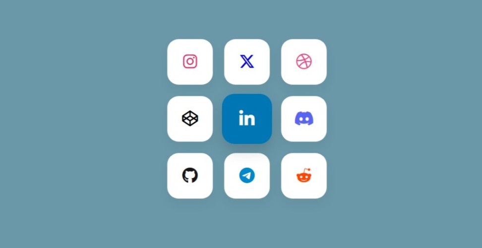
The program Awesome Social Media Buttons with Hover Animation starts with the webpage showing Nine icons or buttons of Nine different Social Media Networks. Once you hover over a certain button, the hovered network is shown. This hover animation is solely done using HTML and CSS.
What You’ll Learn:
- How to structure the Social Media Icon Hover Effects in HTML
- How to style the Social Media Icon Hover Effects in CSS
Step 1: Structure the Social Media Icon Hover Effects in HTML
Start by creating a new file called (index.html). Then, copy and paste the HTML code provided into this file. Remember to save it with the (.html) extension.
<!DOCTYPE html>
<html lang="en">
<head>
  <meta charset="UTF-8" />
  <meta name="viewport" content="width=device-width, initial-scale=1.0"/>
  <title>Social Media Grid</title>
  <link rel="stylesheet" href="styles.css">
  <!-- Font Awesome CDN -->
  <link rel="stylesheet" href="https://cdnjs.cloudflare.com/ajax/libs/font-awesome/6.5.0/css/all.min.css">
</head>
<body>

  <div class="grid-container">
    <a href="#" class="social instagram"><i class="fab fa-instagram"></i></a>
    <a href="#" class="social x-twitter"><i class="fab fa-x-twitter"></i></a>
    <a href="#" class="social dribbble"><i class="fab fa-dribbble"></i></a>

    <a href="#" class="social codepen"><i class="fab fa-codepen"></i></a>
    <a href="#" class="social linkedin"><i class="fab fa-linkedin-in"></i></a>
    <a href="#" class="social discord"><i class="fab fa-discord"></i></a>

    <a href="#" class="social github"><i class="fab fa-github"></i></a>
    <a href="#" class="social telegram"><i class="fab fa-telegram-plane"></i></a>
    <a href="#" class="social reddit"><i class="fab fa-reddit-alien"></i></a>
  </div>

</body>
</html>
Step 2: Styling the Social Media Icon Hover Effects in CSS
Create a new file called (style.css) and copy the provided code into this file. Don’t forget to save it with the (.css) extension.
/* Reset */
* {
  box-sizing: border-box;
  margin: 0;
  padding: 0;
}

body {
  background: #eeeeee;
  display: flex;
  justify-content: center;
  align-items: center;
  height: 100vh;
  font-family: 'Segoe UI', sans-serif;
}

/* Grid container */
.grid-container {
  display: grid;
  grid-template-columns: repeat(3, 80px);
  grid-gap: 20px;
}

/* Social media button style */
.social {
  height: 80px;
  width: 80px;
  background: #ffffff;
  border-radius: 20px;
  box-shadow: 0 10px 20px rgba(0, 0, 0, 0.05);
  display: flex;
  align-items: center;
  justify-content: center;
  font-size: 28px;
  color: #333;
  text-decoration: none;
  transition: all 0.3s ease;
}

/* Hover effects per brand */
.social:hover {
  transform: translateY(-5px);
  box-shadow: 0 12px 25px rgba(0, 0, 0, 0.1);
}

.instagram:hover {
  background-color: #fdf0f3;
  color: #e1306c;
}

.x-twitter:hover {
  background-color: #f0f0f0;
  color: #000000;
}

.dribbble:hover {
  background-color: #fdf0f6;
  color: #ea4c89;
}

.codepen:hover {
  background-color: #f0f0f0;
  color: #000000;
}

.linkedin:hover {
  background-color: #e8f4f9;
  color: #0077b5;
}

.discord:hover {
  background-color: #e6e9ff;
  color: #5865f2;
}

.github:hover {
  background-color: #f5f5f5;
  color: #000000;
}

.telegram:hover {
  background-color: #e0f5ff;
  color: #0088cc;
}

.reddit:hover {
  background-color: #fff5f0;
  color: #ff4500;
}
Final Conclusion
You correctly created a working Create Social Media Icon Hover Effects in HTML and CSS. The source code can be accessed free of charge and comes as a .zip file which will need to be extracted.
Happy Coding!